A bit about working at Mettle
I’m really proud to be part of the Mettle team. I think there are few opportunities in our working lives when we find the sweet spot. I’ve been a graphic designer for more than 15 years, and I’ve helped various clients, from young startups to global banks. Clients with small budgets, but big ideas and clients with huge budgets but slow processes.
We’re building a product that we believe in, and we really want to help our customers succeed.
Before I joined the team at Mettle, I was actually a customer (customer number 7, I think). I was using the account to manage my finances and invoice clients for my freelance design business. I loved the product and found the support team very friendly, so when the opportunity came up, I jumped at the chance to join Mettle as a product designer.
At Mettle, we all have the opportunity to make decisions that have an impact on our customers. Every decision counts. We operate like a small business, so we feel that we’re the best team to support our users.
Website design specs for front-end software engineers
Our customers are our heroes
A key thing we identified during competitor research is that a lot of other companies tend to make a hero of their app, and their bank card. We agree that it’s important for our customers to know that we have a great app, and we also think that our card looks pretty cool – but the priority has always been our customers. So it makes sense to make them the heroes of our website and our marketing campaign.
Our marketing team worked closely with a few of our early customers, and arranged photo shoots in their business environments. It’s real, and it’s gritty. It captures authentic people, with strong character. These people truly represent what we believe Mettle is all about. No generic stock photography – and no fake smiles.
Saving our customers time
The team I’m working in is focused on providing a smooth experience for new customers. This starts with the website. I’ve had the opportunity to completely redesign it, working closely with the other designers, a content designer, developers, and more. We still have a lot of work to do but I’m very proud of what we’ve achieved so far. It’s all built from scratch – no cookie-cutter templates.
We did a lot of competitor analysis – to see what other companies do well, and not so well.
One common theme that we discovered is that a lot of other companies seem to throw a lot of content on their websites. A huge amount of content. It would probably take you a lifetime to read all their pages. On the surface, you have to give them credit for the effort.
But when we speak with our customers, one of the most common things they tell us is that they have limited time, and they find business finances intimidating and unnecessarily confusing.
Our customers are smart people, and they’re perfectly capable of dealing with their finances. But they want to spend their time doing what they love.
So the last thing we wanted to do was bombard people with lots of content. Our content designer, Daniel, worked in collaboration with all the product teams to describe what we do in plain English, to make sure it’s clear and easy to understand. And we worked together to structure it on the website in a way that’s easy for anyone to follow.
To quote Steven Krug – the author of Don’t Make me think: A Common Sense Approach to Web Usability – “Experts are rarely insulted by something that is clear enough for beginners. Everybody appreciates clarity.”
“We’re not a feature factory” – Jim O’Brien, Lead Web Developer
Lots of people at Mettle have great ideas about features to build, but we always make sure we create what our customers need – not what we ‘think’ they need.
A good example of this is our ‘categorise transaction’ functionality. Holly, another product designer was looking into it this potential feature, but didn’t just go-ahead and design it and work with developers to build it.
She designed just enough so that it could be tested with potential customers. The prototype has the perfect ‘Goldilocks Quality’ (a term from the book Sprint, which simply means creating something that’s real enough that it can be used for testing, but not so real that it takes too long to make).
Holly brought in potential customers to see if the feature was something that would benefit their businesses. The testing didn’t take long and was really valuable. We got to see first-hand how customers felt about the feature, and it significantly changed the direction of what we’re creating for them.
We’re now confident that we’re building something that our customers really want and need.
What’s next for design at Mettle?
Well, for the team I’m working in, our next priority is to focus on refining the onboarding journey for new customers – from downloading the app, to getting started with the account.
In order to keep customers safe, we need to know about their business and who they are to make sure that Mettle is right for them. This often means asking some in-depth questions – but they’re important and help us perform the right checks.
We need to find the right balance of getting the information we need and making the onboarding process as simple as possible.
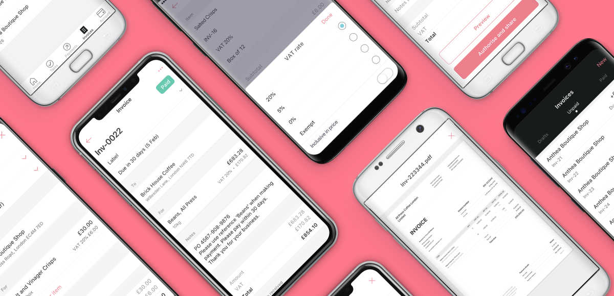
Mettle onboarding screen
The Mettle Growth team
Some of the Mettle design team toolkit
Sketch – this is the industry standard software for creating User Interface designs for most digital products
Adobe Photoshop – we use this for occasional image retouching and creating some mockups
Adobe Illustrator – we sometimes use this for creating icons and other illustrations, although some of the designers now do this straight in Sketch
Marvel – we use this for creating interactive prototypes
Whimsical – for creating user journeys
Zeplin – for handing off designs to the developers
Pen and paper – for sketching – well, I’m a super nerd and an Apple fan boy, so I use an iPad with the Apple Pencil
Recommended resources if you’re interested in design
The design of everyday things – Donald Norman
Sprint – Jake Knapp
Don’t make me think – Steve Krug
Pretty much everything – Aaron Draplin
Thinking with type – Ellen Lupton
AJ&Smart YouTube channel and podcast
The Futur YouTube channel and podcast
We have so much more exciting stuff to come. Watch this space. And if you’re already a customer, please get in touch through the in-app chat to let us know of any ideas that might benefit your business.


